Creative Punk had the exciting opportunity to design the visual identity for SO LUSH, a bold new cocktail-in-a-can brand targeting a vibrant, younger audience. Positioned as the ultimate drink for music lovers, SO LUSH is set to make a big splash with a high-impact promotional campaign across the UK’s biggest music festivals.
The Brief:
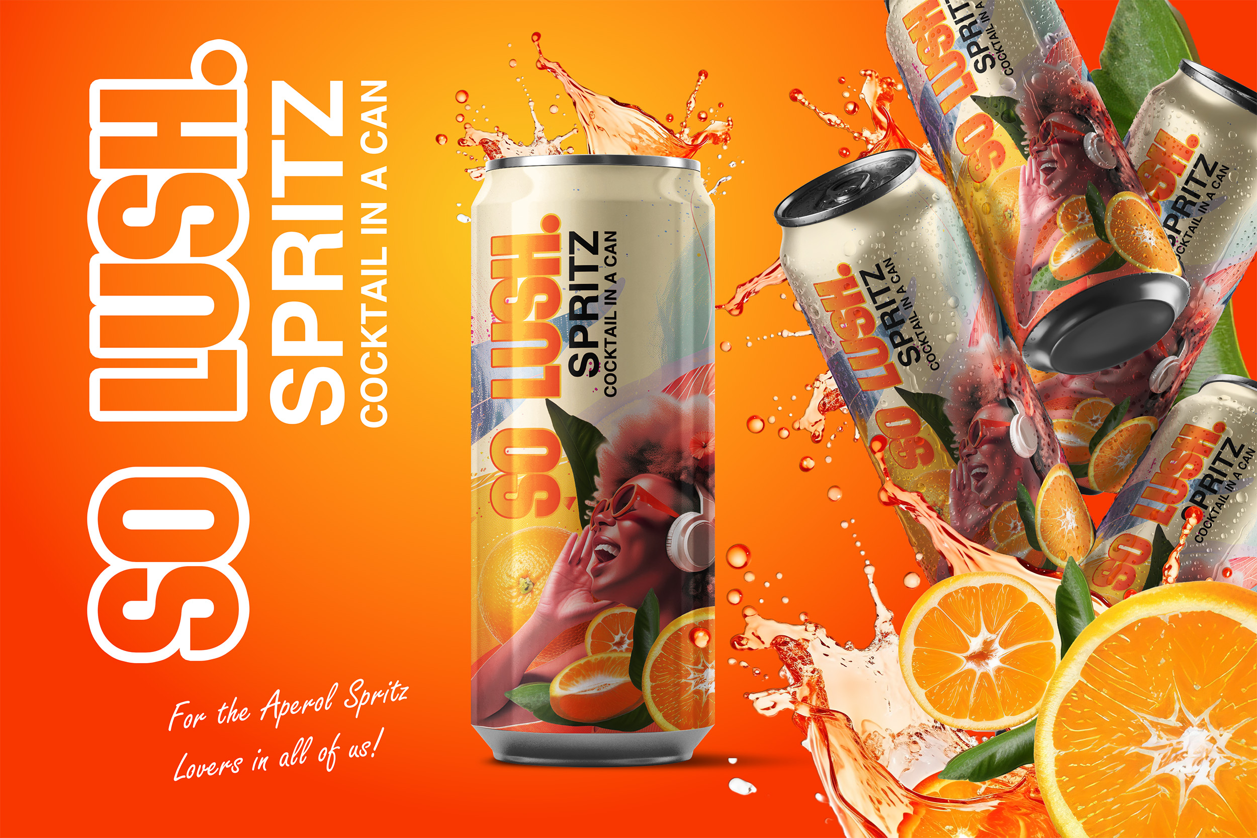
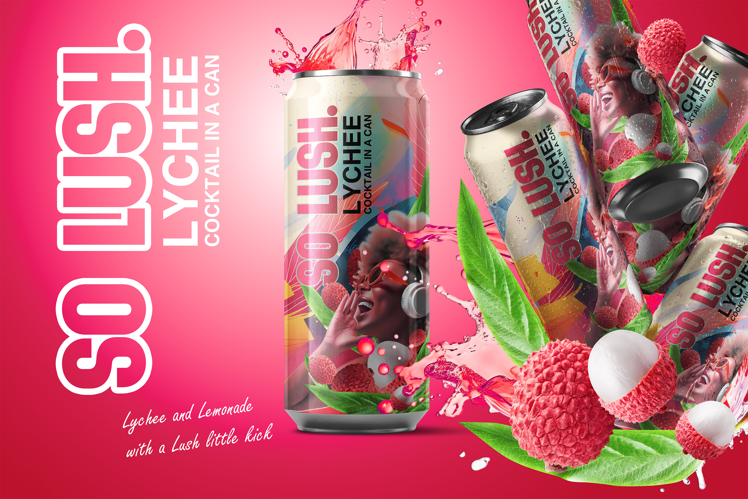
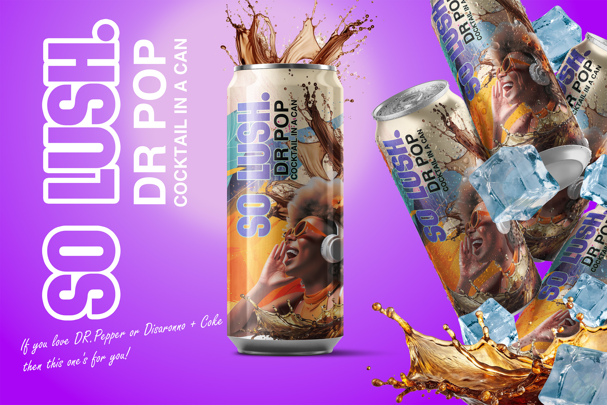
The task was to create a standout design that would resonate with the brand’s youthful, festival-going audience. Each of the three flavors needed its own unique, visually impactful look while maintaining a cohesive style that ties the range together. The designs had to reflect the energy and fun of music festivals while being bold enough to grab attention in crowded, dynamic environments.
Our Approach:
We began by diving into the world of festival culture, drawing inspiration from the vibrant colors, patterns, and energy that define these events. Each can design was carefully crafted to evoke a sense of individuality and excitement, using high-contrast visuals and playful elements that mirror the spirit of SO LUSH. While each flavor boasts its own distinctive aesthetic, the range is united by a bold and youthful design language that speaks directly to its target audience.
The Result:
The final designs are a visual celebration of music, fun, and individuality. Each can features a dynamic, high-impact look that stands out both on the shelf and in the hands of festival-goers. Whether it’s a refreshing sip under the summer sun or a late-night party essential, SO LUSH is designed to be as unforgettable as the events it’s part of.
With its striking visual identity and energetic vibe, SO LUSH is ready to take the festival scene by storm.
So Lush
November 8, 2024